Sunday, April 13, 2014

QGIS: Save to KML

QGIS is free, open source, multi-platform. Download at qgis.org. It has lots of prerequisites, so be patient and methodical.

For this exercise, we are opening a file with all counties in Texas, then selecting the five in our MSA (Travis, Williamson, Hays, Bastrop, Caldwell) and saving them out separately as its own KML file.

This is a QGIS lesson on how to convert a .shp file to .kml to be used with Fusion Tables.
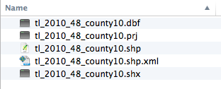


Download the zip file tl_2010_48_county10.zip. Unzip the file so you have a folder of contents. Note there are five files, including one .shp

In QGIS, go to Layer > Add Vector Layer. (Or look for the icon at left.)  Browse to your .shp file. 


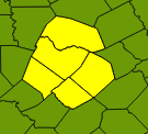
Use the selection tool (pictured at left) to select Travis county, then hold the Command key (Mac) and select on Bastrop, Caldwell, Hays and Williamson counties. This should allow you to add them to your selection. It will look something like the photo at right, through your colors may be different, since QGIS picks them at random.


In the layers panel at left, right-click on the layer and choose Save Selection As ...


Click on the Format option and then change the format option to "Keyhole Markup Language (KML).


Next, you need to choose where to save the file, and what to name it. Under Save As, click the Browse button, name your file in the Save As window what you want to name it, then negotiate to the folder where you want to save your file. Click "Save" to set the settings.


Then you'll need to check your CRS, or Coordinate Reference System. I've been OK using the NAD83:4269 setting, though I've seen some references suggest that Google wants WGS84:4269. Type the number into the Filter field and you'll see your's listed. Choose the one in the bottom window.


Once all of those are set, you can hit OK on the "Save vector layer as" window, and your new KML file will be saved. It is that new AustinMSACounties file that you can upload into Google Fusion Tables.


Online charting tools

Online charting tools
There are a lot of online tools to help you create simple data visualizations and embed them in your story, with more cropping up every day. Most of them are built upon Mike Bostock’s Data-Driven Documents, a powerful javascript library for visualizations.


These tools can be both easy and powerful, but they do have some disadvantages:
  • You are dependent on their hosting. If their site goes down or their business fails, your visualization and your data are gone.
  • Tools that start free may not always remain so. Some begin charging as you add more graphics, or after a period of time, or by the internet traffic that comes to your chart.
  • You can only do what the tool can do. If the tool doesn’t have the feature you need, it may not be extensible enough for you to add or create your feature.


But there is a lot of good, too. All these tools are easy to use and can be easily embedded in your story online.

DATAWRAPPER

Datawrapper.de is a German-built, free, open source charting service built upon D3 that has improved significantly over the past year. It’s listed first here for a reason: It powerful and easy to use. It has bar charts, pie charts, line charts, tables and even maps. The Guardian is a heavy user of datawrapper, hosting their own instance.

VIDA.IO

Vida.io is similar to Datawrapper, but using Google’s chart API as a back end.

INFOGR.AM

Infogr.am is a new, freemium tool to create online information graphics that allow you to mix text, photos and data. The charts you can create are professional looking.

INFOACTIVE

Infoactive is a freemium interactive infographic and data visualization service that is in open beta (as of 7/7/2014). It allows two free graphics before a subscription is required.

CHARTBUILDER

Chartbuilder is a static chart creator built by the Quartz.com website. It uses D3 to make the graphics, but they are not interactive at all. Benefits are the software is open source, so with effort you could create a version with your own styles. See an example on qz.com.

TABLES

If you are starting from scratch, my favorite table maker is TablesGenerator, which also has data to other formats. Tableizer is a dirt-simple spreadsheet-to-table converter from data. The columns are not sortable, nor is there any other interactivity, but it is a start.


There are probably dozens more services. The Google gives us ChartGo, OnlineChartTool, and Hohli. Use at your own risk or pleasure.

OTHER TOOLS

  • Timeline tools
    • TimelineJS: A timeline tool that’s as easy as filling out a Google Docs Spreadsheet.
    • StoryMap: TimelineJS + location. Nicer display than TimeMapper.
    • TimelineJS w/ Gigapixel: Zoom around a single image to tell as story.
    • TimeMapper: TimelineJS + location, but StoryMap is cooler.
    • Maptal.es: Another geographic timeline
  • SoundCite: Inline audio to support a story. (Not really a visualization tool, but still cool.)

Wednesday, April 9, 2014

Datawrapper graphic published

  Datawrapper.de is a pretty simple yet powerful visualization service. It can make bar graphs, pie charts, maps, tables and more.
  Here is an example map that was created using their sample data. After I copied the iframe code from Datawrapper, in Blogger I had to go to the HTML window to paste it in.

Wednesday, March 19, 2014

A highcharts test

This is a bit of a test. Will Highcharts work? Looks like it will.

Monday, March 3, 2014

Notes from NICAR 2014

This was my first NICAR conference, which has a focus on data-driven reporting and other technical aspects of our craft. The IRE conference usually has similar content, but is also broader in scope.

Here's the full schedule from NICAR 2014 and from IRE 2013 last year. This year's IRE 2014 will be in San Francisco on June 26-29.

But back to NICAR 2014. Here are the goods:


Here is a quick list of the panels I went to and what I got out of them.

Wednesday

Before NICAR in Baltimore, I also went to Tapestry, a data visualization conference sponsored by Tableau. Unlike the 900+ NICAR, Tapestry was limited to about 100 participants, all on the same tract. Speakers included Alberto Cairo, Aron Pilhofer, Fernanda ViĆ©gas and Martin Wattenberg and a host of others. It was good for inspiration, connections and a preview of Alberto's talk at NICAR, allowing me to double up on some content.

Thursday

  • Since I had seen Alberto's talk the day before, I could skip the first part of my D3 News camp to take some MySQL: I actually took two courses on this, which was more any overview of how a database manager can help you vs. Access, and an intro to Navicat, a paid tool to use a MySQL database. It went a little slow for me, but I did enjoy CIR's Chase Davis' take on it.
  • I hoped into the last part of the Intro to D3 talk, which really was a panel walk through of basic code, and I suffered from not being at the beginning. Quickly reviewed notes and hoped I would be OK for afternoon hand-on session.
  • Afternoon D3: In short, this helped me understand the structure of D3 better, but didn't build any proficiency and I would have trouble creating the most simple viz now. But it was better than not going.

Friday

  • Three hour-long sessions on statistics. The intro was really a get-to-know SPSS, a powerful and expensive statistics software package. We didn't get to the most important part of comparing two types of categorical information, so I felt like we missed out a little. The next session on comparing two continuous fields (linear regression) was awesome, and the third on comparing a categorical and continuous information (logistic regression) was also valuable.
  • Since I didn't get much actual SQL on Thursday, I chose the Intro to SQLite class and got the best tip of the conference: you can run SQLite in Firefox using the SQLite Database Manager, with no other software to install (at least on a mac.) This might be how I teach SQL in Data-Driven Reporting next year.
  • Next I helped Scott Klein (ProPublica) and Michelle Minkoff (AP) teach a session on grabbing data from the web.
  • Last was the lightening talks, 10 quick talks. It was a packed room ... well over 800 people. They were all good ... 

Saturday

  • Building a data-journalism course. One of the panelists from Maryland has his students work on the same data set so they can help each other. Amanda Hickman works to get more basic data and viz/charts in earlier courses so students have familiarity so they can get further in class. A couple have groups of students working on the same long-term project or different parts of same subject. Canadian used a donuts to describe databases (then ate them).
  • Clean, clean, clean your mess. Regular expressions class was helpful for this. I had no problem with the code, but had some problems with teaching style. Cleaning data class introduced OpenRefine and class after was helpful in reinforcing those skills. Refine is awesome.
In between all this I made spent good time with folks from the Canadian Broadcasting Company, Orlando Sentinel, Huffington Post, Pixar/Paramount, the Texas Tribune, the AJC, Dayton Daily News, Seattle Times, the Vancouver Sun, small papers in Pennsylvania, South Carolina and god knows where else. And speaking of God, some good bar time with gentleman attending a Catholic youth ministries and a different time with vets getting training at Veteran's Affairs. Also several folks from various schools and many more I'm just not remembering.

My eyes were opened to some database structures, and skills refined for Refine, which I proceeded to crash time after time for four hours straight working on a huge dataset. The statistics classes were well worth it, too ... I know I need to learn more, but that is OK.

Shaping data and the Tableau Data Shaper


Here is a good post that explains how you might want to clean up and *shape* your data for display in Tableau. How you format your data before import can determine a lot about what you can do with it once in Tableau.

The Tableau Add-in for Excel is a great help for this. Here is a post with detailed instructions about it, but I have some short cuts here, because our school machines don't give you admin access and you might not be able to download and run the .exe file.


  • Download this file (Tableau.xlam) and put it in Documents > My Tableau Repository.
  • Go into Excel > File > Options > Add-ins
  • At the bottom, choose Manage > Excel Add-ins and click Go
  • Browse to fine the Tableau.xlam file in Documents > My Tableau Repository.
  • Click OK through the boxes and you should end up with the "Tableau" menu in Excel.

Tuesday, February 4, 2014

Getting a Lat/Long from Google Maps

UPDATE 4.13.2014: It looks like the "new" Google Maps has returned the old functionality of being able to right-click on any spot in a map and choose "What's here" to get a decimal-based latitude and longitude. So I think the directions below are irrelevant now.

----------------------

It's easiest to do from the "classic" google maps. Who knows how long that will be available, so I've explained how with the "new" maps as well.
  • Type in the address and hit return and make sure Google Maps takes you to the right place.
  • Right-click on the map at the location and choose “What's here.”
  • That will put something like this in the search bar: “30.258659,-97.744548”
  • Put the first number that usually starts with “30” in the Latitude field.
  • Put the second number that usually starts with ”-97” in the Longitude field.
If you have the “new” google maps, you have to do some extra work to get lat/long. It's easier to just use the “classic” link above, but if you insist:
  • Type in the address and hit return to find the location
  • X-out the location in the search bar so the pin goes away.
  • Click on the map where the pin was, (and then maybe click again) and a window will come up showing the address and the lat, long, but it will formatted wrong. It will be something like: 30° 22.096', -97° 42.209'. Copy that text.
  • Go to http://dbsgeo.com/latlon/ and paste in the text into Place Name.
  • Make sure it takes you to your location, then from the “Latitude, Longitude” under the map copy the “30” number into Latitude into the homicide database, and the ”-97” number into Longitude.