QGIS is free, open source, multi-platform. Download at qgis.org. It has lots of prerequisites, so be patient and methodical.
For this exercise, we are opening a file with all counties in Texas, then selecting the five in our MSA (Travis, Williamson, Hays, Bastrop, Caldwell) and saving them out separately as its own KML file.
This is a QGIS lesson on how to convert a .shp file to .kml to be used with Fusion Tables.
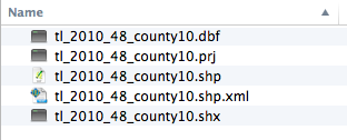
Download the zip file tl_2010_48_county10.zip. Unzip the file so you have a folder of contents. Note there are five files, including one .shp


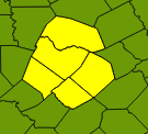 Use the selection tool (pictured at left) to select Travis county, then hold the Command key (Mac) and select on Bastrop, Caldwell, Hays and Williamson counties. This should allow you to add them to your selection. It will look something like the photo at right, through your colors may be different, since QGIS picks them at random.


Next, you need to choose where to save the file, and what to name it. Under Save As, click the Browse button, name your file in the Save As window what you want to name it, then negotiate to the folder where you want to save your file. Click "Save" to set the settings.

For this exercise, we are opening a file with all counties in Texas, then selecting the five in our MSA (Travis, Williamson, Hays, Bastrop, Caldwell) and saving them out separately as its own KML file.
This is a QGIS lesson on how to convert a .shp file to .kml to be used with Fusion Tables.
Download the zip file tl_2010_48_county10.zip. Unzip the file so you have a folder of contents. Note there are five files, including one .shp
In QGIS, go to Layer > Add Vector Layer. (Or look for the icon at left.) Browse to your .shp file.
Use the selection tool (pictured at left) to select Travis county, then hold the Command key (Mac) and select on Bastrop, Caldwell, Hays and Williamson counties. This should allow you to add them to your selection. It will look something like the photo at right, through your colors may be different, since QGIS picks them at random.
In the layers panel at left, right-click on the layer and choose Save Selection As ...
Click on the Format option and then change the format option to "Keyhole Markup Language (KML).
Then you'll need to check your CRS, or Coordinate Reference System. I've been OK using the NAD83:4269 setting, though I've seen some references suggest that Google wants WGS84:4269. Type the number into the Filter field and you'll see your's listed. Choose the one in the bottom window.
Once all of those are set, you can hit OK on the "Save vector layer as" window, and your new KML file will be saved. It is that new AustinMSACounties file that you can upload into Google Fusion Tables.
