Data Visualization, Spring 2015
Tableau has plenty of useful geography built in that we can utilize for data: Countries, states, counties, zip codes and even congressional districts. But, it doesn't have school boundaries, voting precincts or some other geographic features that we could use in journalism.
Unfortunately, Tableau doesn't read the Esri shapefile format or the Google keyhole markup language, so you can't pull in these custom shapes like you can with QGIS or Google Fusion Tables. Tableau understands polygons, and while it is hard to manually convert shapefiles to this polygon format, the company Alteryx has a tool that does it for us.
This lecture walks through converting a shapefile to polygons, pulling it into Tableau and then matching it with data to create a map.
Our goal is to use the City of Austin voting precinct shapefiles and election results to show which candidate garnered the most votes in each precinct for the 2014 City of Austin races. We'll need three things to complete this task:
First, we need a shapefile that will have a field we can link with our data. In our case the CoA_precincts_2012.zip shapefile that I got from the city demographer, that includes the precinct. (Go ahead and download it. You do NOT need to unpack the zip file.) It has the shapes of voting precincts within the City of Austin boundaries.
Next, we'll need our data, coa_winnerslist.xlsx. (Go ahead and download it.) This data set was prepared the day after the election based on total returns provided by the Travis County Elections division. There was a bit of scripting involved to get the file into the shape you see here, which we won't go into here.
The magic happens with our third item, an Alteryx Analytics Gallery tool called Tableau Shapefile to Polygon Converter. This will take our Esri based shapefile and convert into polygons Tableau can understand. You will need an Alteryx account, which is free. (Sign up now.)
Convert the shapefile to polygons
- Go to the Alteryx Analytics Gallery and under Search Workflows look for "Tableau Shapefile to Polygon Converter"
- Once there, click on the Signin button, put in your credentials, and then click the Run button.
- You'll be asked to upload the shapefile in zipped format … we will use the CoA_precincts_2012.zip shapefile described earlier. (If you are doing this with a different shapefile, make sure you have all the files in a folder and then zip them together. I can run through how to do this in class, or Google it.)
- Once you run the process you will get a window that allows you to download PolygonConverted.tde, which is a Tableau Data extract. There is another file that is a .csv that we don't need for this.
- Download this with you data files so you can find it.

Plot the polygons
- Start a new Tableau project.
- When asked to connect to a file, choose Tableau Data Extract and then go find your PolygonConverted.tde file you downloaded from Alteryx. You'll be asked to Create an Extract Connection, where you can just OK the default.
- There are three fields (PointID, PolygonID an SubPolygonID) that show up as Measures that need to instead become Dimensions. It's easy enough to do so, just drag them from the Measures area into the Dimensions area. (Pic at right)
- Double-click on Latitude to move it to Rows
- Double-click on Longitude to move it to Columns
- Change the dropdown on Marks from Automatic to Polygon.
- Now we'll place the points. There are three parts:
- Drag PointID onto Path
- Drag PolygonID to Detail
- Drag SubPolygonID to Detail
- This will give you a monochoromatic view of the map and you can't see the boundaries. Let's adjust that:
- Click on the Color mark and under Effects change the border color to white.

Import and join data
Next, we'll pull coa_winnerslist.xlsx into our project and create a relationship to the polygon shapes.
- Choose Data > Connect to data.
- Choose the Microsoft Excel type, and go find your coa_winnerslist file.
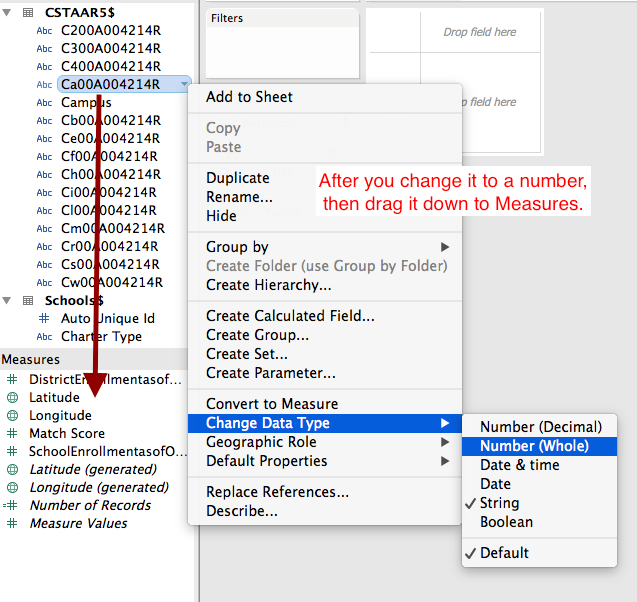
- When the data inspector comes up, change the the type of Precincts to a string instead of a number. (Tableau sees numbers here and things they are continuous values that can been added together, but we need them to be a string because they are essentially a text code for the location.) Click Go to Worksheet.
- We'll still need to move Precincts from Measures to Dimensions. Click and drag it from one box to the other, just like we did PointID, etc. (What's going on here is Tableau sees that field as a numbers, but we need to convert it to text to match our polygon file.)
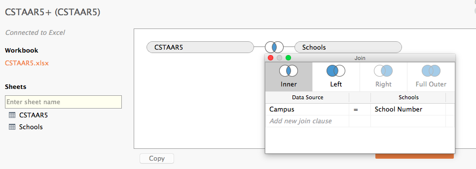
- Now we have to connect the "Precincts" fields in both data sources so they can talk to each other:
- Go under Data > Edit Relationships
- Click on Custom and then Add to define a relationship. (See screenshot below)
- Choose the fields you want to match up. In this case, "precincts"


- Lastly, you have to click on the green broken link and turn it into a red connected link. In this case red is what you want.
- This last part is very similar to the "join" we did in Tableau last week. By linking these together, we are joining the two sets.
Build our viz
We now have all the pieces in Tableau, and our data is connected to our shapes, so we can build the main portions of this map. Remember our goal is to show which candidate got the most votes in each precinct.
Filter by race
- We will want to filter the map for each race, so take the Race dimension and drop it on Filters. When you do, you'll be asked which fields to include … use all except Null.
- Click on the dropdown on the Race pill and choose Show Quick Filter. You can then use the dropdown on the filter created (which might be under your Show Me pallete) and make that a single-value dropdown.
- Go back to that dropdown, choose Customize and uncheck "Show all values".
Candidate visual cue
- Take the Candidate Name field and drop it on the Color mark. This should list which candidate "won" each precinct.
Race results
- We created a special field in the data that included the results of each candidate for that precinct and race. Drag the dimension Race tooltip onto the Tooltip mark and then try it out to see how it looks.
That's the basics of the map. There is some work to be done before it is publishable, like creating a dashboard, writing headlines and chatter, cleaning up tooltips and such, but the basics of the project are there, including the hard part of bringing a custom shapefile into Tableau.