This lecture is designed to introduce students to Tableau so they can see how it can be used to explore a data set.
Versions of Tableau
There are many flavors of Tableau, but they are essentially the same program.
- Tableau Desktop is the full version. It can connect to files and databases. You can save your work to your computer at any time and later publish it online on Tableau Public. It can be quite expensive if buying directly, but you can get a free educational license as a student or a free professional license through an IRE membership.
- Tableau Public is both a website and software. The software is essentially the same as Tableau Desktop, but you can't save files to your local computer; you can only publish files online on the Tableau Public website. Anyone (including yourself) can download workbooks from Tableau Public and continue to work on them.
- Tableau Server is a business class version of the software. Not really applicable to us.
Getting started
- We'll use a data set about gun deaths in Travis County. I'll talk about and show the original data in class, and explain how it was cleaned up for use in Tableau.
- Download this data file for this lesson: 04 Data - Travis Gun Deaths
- The next thing that comes up is a view of your data. This is the time to check that all your data types are correct … that numbers, strings, dates and locations are noted properly. Once all is checked (Travis Gun Deaths should be fine) click on the big red Go to Worksheet button.
- Note on the left panel the Dimensions and Measures shelves. All the categorical data like Death Type, ZIP and such are Dimensions, while all the quantitative values that you can add up have been put on the Measures. (It's actually a bit more complicated than that, but that will do for now.)
- In our case, Age has been counted as a Measure, but we'll never add ages together, so we'll drag and drop it up to the Dimensions area.
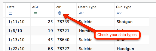 Launch Tableau and you are first taken to the screen to connect to your data. Choose your file type and open the file. For this we'll choose Microsoft Excel and then go find the Travis Gun Deaths.
Exploring through Show me
Tableau can be both very easy to use and quite complicated. The Show Me palette can help guide you on ways to explore your data.
If you don't see the whole Show Me palette at the top-right of the screen, click on Show Me so it drops down.
- Click on the Date dimensions, and the hold down the Command key and click on the Number of Records measure. (I'm assuming Mac use throughout … use Ctrl where applicable.)
- As you click on measures and dimensions together, the Show Me palette will light up the chart types that might work with your data. Since we are looking at a date, let's choose the bar graph. (Left side, 3rd down.)
- What you get (probably) is a simple bar chart that shows the number of records by year, probably showing horizontal.
- When I look at date graphics, I like the dates to show at the bottom, a more vertical alignment, so I can see the years go from left-to-right. You can swap the rows and columns on the chart by clicking on the swap button, which looks like this:
We can change that to see it by month by using the dropdown in the Date field that is now on the columns shelf and pulling down to the Month that also shows the year. (It shows May 2011: see screenshot.)
- Now we could use some help reading the number of deaths for each month, so let's add some labels. Take the Number of Records measures and move it to Marks palette and drop it right on top of the square called Label. This should add the number of records -- i.e., number of deaths -- to each bar.
- If you have trouble discerning which exact month a bar represents, you can hover over that bar with your cursor to see a tooltip that gives details about that data. Now we can see April 2010 had that most deaths with 14.
- I wonder if all April's are that bad. We can check by changing the Date field on the Columns shelf to the other Month listed there, where it just shows "May". Now we are looking at deaths by month for all three years, and over that period April was fairly normal, but November is pretty high.
- Could this November trend be holiday stress? Why might explore a little further by dragging the Death Type dimension to the Marks shelf and drop it on Color. This now divides our bars so we can see all the suicides, homicides and accidents. November is showing the most suicides, so maybe that is a lead to talk to mental health professionals.
- If you find the bars difficult to discern all three types of death together like this, you can change the chart type on the Marks shelf by using the dropdown there to move from from Bar to Line.
- If you don't like that move, you can use the back button at top left to undo that move and any many more previously. You can then use the forward button to return. Stop where you wish, and then change the name of the sheet at the bottom to something useful by double-clicking on Sheet 1 and renaming. It works similar to Excel sheets.
- Down by the sheet names, click on icon that show a bar chart and + sign on it to start a new blank sheet.
(The other one starts a dashboard, which we'll talk about later.)
- Let's do one last thing with dates. Click on Date and Number of records and choose the Line graph from the Show Me tab.
- Go to Date in the columns shelf to change from YEAR and pull down to combined years set under More and choose Weekday. This gives you the most deaths by day of the week. Drop your Number of Records measure on the Label tab on Marks and then rename your sheet Weekday.
- Last thing with this section: We've done a bit of work, let's save the workbook so you don't lose it. Under File > Save or click on the disc icon. Save it where you can find it again.
Another bar chart with Age
Bar charts are pretty telling. Let's make another one.
- Create a new sheet
- Click on Age. Hold down Command and click on Death Type and Number of Records to add them to the selection.
- Click on the stacked bar chart in Show Me. (3rd row in the middle).
- This shows you the deaths by type, by year. In this case, I think it is more readable as horizontal bars, so use
to flip the axis.
- Drag Number of Records measure to the Label tab on Marks.
This gives us a good view by date, but when we use color to show the death type, we lose the total number of deaths for each age. Let's add that back.
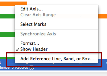
- On the bottom axis is the label Number of Records. Right-click on that to get a pop-up menu and choose "Add Reference Line, Band or Box."
- Set the following:
- Scope: Per cell
- Value: Number of Records by SUM.
- Label: Value
- This adds the total number to the end of the bar. Sometimes it looks funky if there is only one color bar, but I don't know how to fix that ;-(
- Save your sheet as "Age, type of death"
Null values
Note the Null value for age. We could exclude this to get rid of it, but it's better to first understand why it is there. Let's find out what record it is.
Click on or hover over the Null record until the tooltip comes up.
- Roll over the the table looking icon on the far right of the tooltip and click on it.
- This brings up a "View Data" that shows you the Summary of all the records used in that bar.
- Click on Underlying and that will show you the individual records that make up the bar. In this case, that records has a blank where age is. We would want to go back to our original data source to find out why. (We simply could not determine the age of that victim.)
Maps
Tableau has a lot of map functionality built into it. If your data set has geography like state, city, zip and such, it will try it's best to map that data. Sometimes you have to help it. (When you get outside of common shapes like that to say, school districts or oil fields, it is much harder to use Tableau.)
- We'll start with a new sheet, click on Zip and Number of Records and go to the Show Me pallet and choose the Map with the blue dots. This draws a dot by ZIP code where the dot is bigger based on the number of records.
You'll notice there is a dot way out in California. This is a case where someone was shot in Austin but died years later out of state. We will exclude it from the map as an exercise to show how. Click on the dot (or draw a sqare around it with your cursor) to select it, then in the tooltip click the Exclude link. It can be challenging to get that tooltip to come up, but you'll get the hang of it.
- Once that record is excluded (it's not deleted, only hidden from view) the map will refocus to Travis County, though it's kinda hard to discern that with the way the map looks, so we'll work on that.
- In the menus across the very top of the screen, go to Map > Map Options.
- This will bring up a palette on the left where you can change a number of things.
- Change the Style to "Normal."
- Click on Streets and Highways
- Now we can understand what we are looking at a bit more. Let's see how the type of death plays out on the map. Drag the Death Type onto the Color mark and you'll see how they fall upon the map.
- We can isolate those Death Types by creating a filter. If you click on the dropdown for Death Type dimension and choose Show Quick Filter, then you will get a palette on the right-hand side of the screen. (You might have to close the Show Me palette to see it).
- Now you can choose the death types individually and see how they fall upon the map. Let's add some things to make it easier to see:
- Let's add the Number of Records measure to the Label mark so you can more easily see some values, too.
- Click on the Size tab in Marks and make the side larger. This makes all of the dots bigger so the smaller ones are easier to see.
- You might see some interesting trends worth pursuing … what part of the cities see more homicides? What is up with 19 suicides up by the Arboretum?
- You can add some demographic data that Tableau stores into the map with a few steps.
- Under the Map menu, go to Background Maps and choose Tableau Classic.
- Make sure Map Options are up (Map > Map Options).
- Click on Data Layer toward the bottom of the Map Options, and look under US Households to "Household Income (median)". This colors the background map by income, but default to By State. Change By to Zip Code. Change to Block Group to see the difference.
- Zip is probably more appropriate. You can clearly see how the homicides cluster in areas of lower median income. Not sure you can call it causation, but clearly worth further reporting.
- Set your filter to show all the Death Types, then name your sheet "Map."
Tables
Sometimes a table of numbers is still the best way to show data, but Tableau can add some visual cues to help you read it.
- Start a new sheet.
- Click on Date, then hold down the Command key to add Gun Type and Number of Records to your selection.
- In the Show Me palette, choose the colored table at top right.
- You should get a table that shows deaths by year, by guy type. Clearly handgun use is highest, as shown by the darker shade of green.
- Save that sheet as "Gun type"
Dashboards
You can put your various sheets together on a dashboard to show a common thread. You can use filters to build interactivity within the sheets. Dashboards can be tied together as a Story. Tableau can become a powerful presentation tool.
- Create a new Dashboard by clicking on the tab at the bottom that looks like squares and a + sign:
Click on the sheet name "Map" and drag and drop it onto the dashboard.
- Click on the sheet name "Age, type of death" and drag it toward the bottom of the dashboard like you are dropping it on the bottom part of the map. You'll see areas turn grey where the sheet will land when you drop it. If you drop at the bottom, the Map part should split in half and the bar chart should take up the bottom part.
- Take "Gun type" sheet and drop it on the left half of the bar chart.
- Take the "Weekday" sheet and drop it into the space under "Gun type". You'll have something like the screenshot in this section.

Global filters
 This is just a start on a dashboard. You can do a lot to make the dashboard prettier and display more information, but we'll save those nuances for another lesson. We'll show one last thing with the dashboard … using a filter across multiple sheets.
- Click on the Death Type filter at the top right to see the dropdown for that filter.
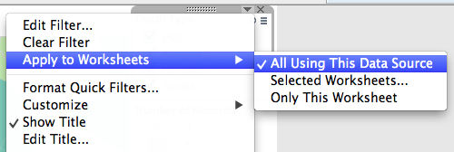
- Click on the dropdown and choose Apply to Worksheets > All Using This Data Source.
- Now, when you check and uncheck the boxes in the Death Type filter, all the data on the dashboard filters according to your selections.
Cleaning up your dashboard
- Make sure you have a headline and well-written chatter to explain what you are trying to communicate. Don't forget to source your data.
- You'll note that you can float different sheets, legends and filters on your dashboard, which helps make nice looking displays. Be wary of trying to float everything. I've found it is best to use tiling for all your sheets, getting them in their general location first, then float only the legends and filters as necessary.
- Tooltips are useful for your readers, and a good place to add information, but they are also a place where you can look sloppy. Click on the tooltip mark to edit.
- Add data: Drag categories onto the tooltip mark to add to it.
- Delete stuff: If you have a map, Lat and Long will end up in your tooltip. Readers rarely need to know those coordinates, so you can usually delete them.
- You can format fonts, spacing, alignment and such in your tooltips, including adding things like percent signs.
- If you've deleted something from the tooltip and need it back, you can use the Insert menu. You can also hit the reset button to get everything back and start over.
- Once you are done formatting your tooltip, uncheck "Include command buttons" unless your readers really need them. They could end up excluding data unintentionally.
- You can edit worksheet titles for formatting and content, or hide them if you don't need them.
Publishing online
There are a couple of things to clean up before you publish online.
- Multiple sheets and dashboards will show up as tabs unless you hide them. So, once you are done, right-click on the sheet name and "hide sheet." You can return to editing it later by clicking on the "Go to sheet" icon in the Dashboard palette, or by choosing it from the dropdown on the upper-right of the sheet on your dashboard.
- The name of your dashboard will be the name of your tab, so write it cleanly.
- The name of your workbook (the file name you saved it as) will be the name of the project online. You can change it later, but might as well get it right now.
- When you are ready to publish, go under Server to Tableau Public and log in. If you don't have an account, then you will need to create one. You can later update your profile to use it as a showcase for your work (like to help get a JOB!)
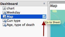
Tableau resources
- Tableau Training and Tutorials
- Blogs like DataRemixed, JewellLoree (both Tableau employees), Viz of the Day (download and study how they are made). Here is a list of others and a really great blog roll.
- Grace Labriola's list: